Stepping boldly, and colourfully, into the future
PCA
PCA is a thriving integrated architecture, interior design and planning firm founded in 1982. Nearing their 40th anniversary, the firm was ready to recreate their brand to reflect the firm they had grown into.
Combo led this comprehensive refresh, starting with strategy. Our approach was holistic and deep-diving. Extensive research included interviews with the PCA principals and senior associates, an analysis of current and historical materials, tours of notable PCA projects, a review of the 2019 client survey and a competitive landscape assessment. Our strategy distilled PCA's essence: an architectural practice invested in designing spaces that reflect both the art and business of what's possible.
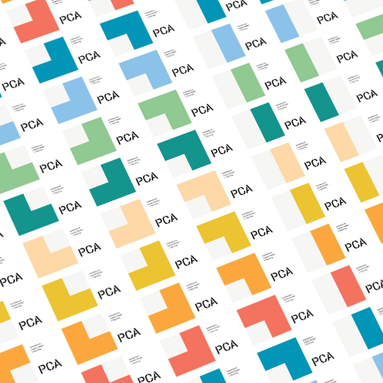
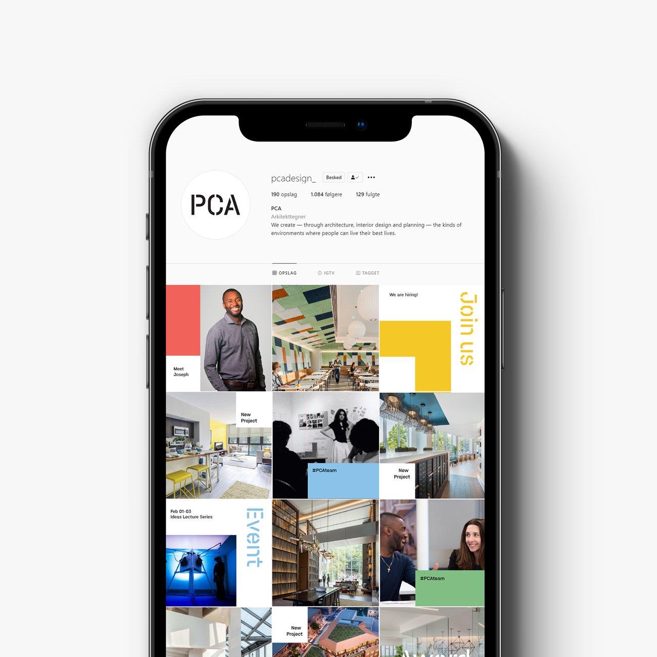
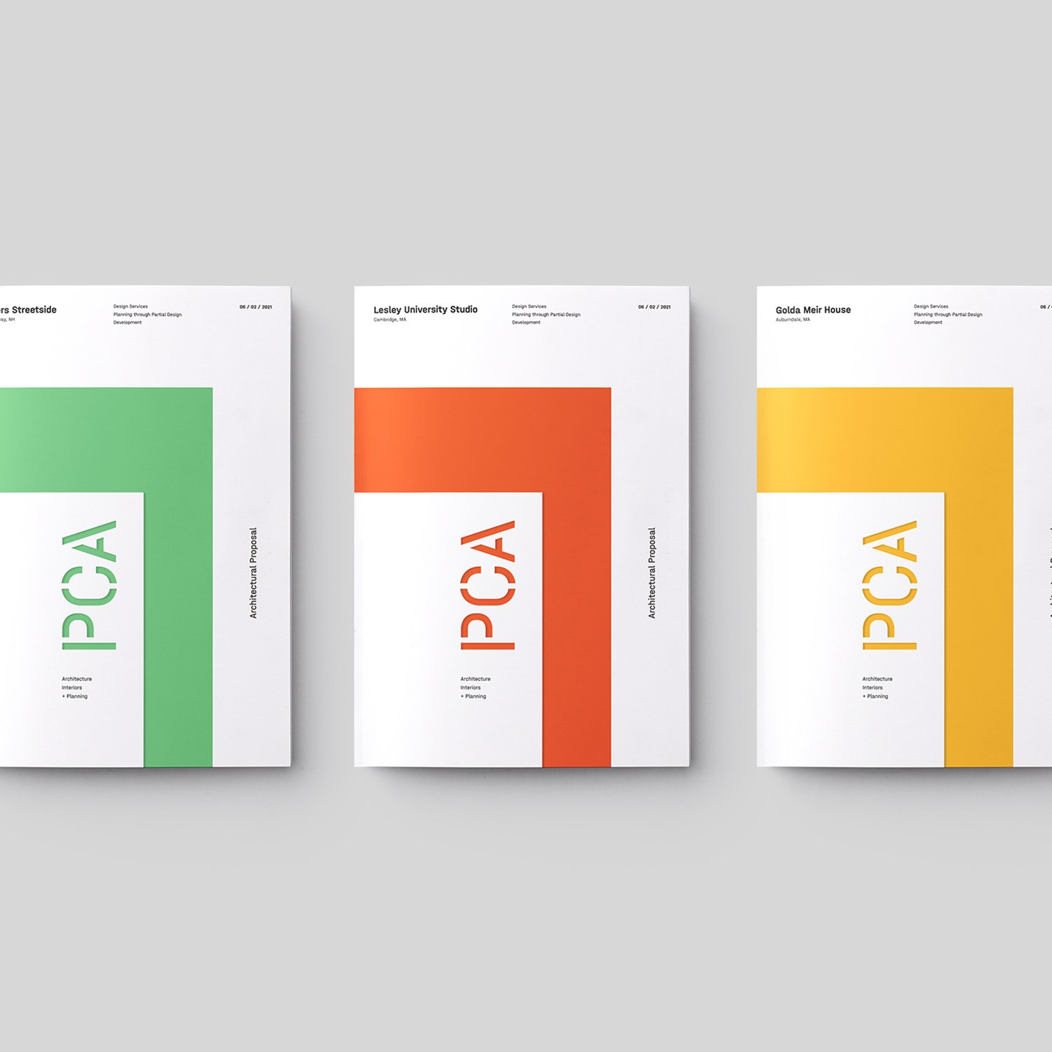
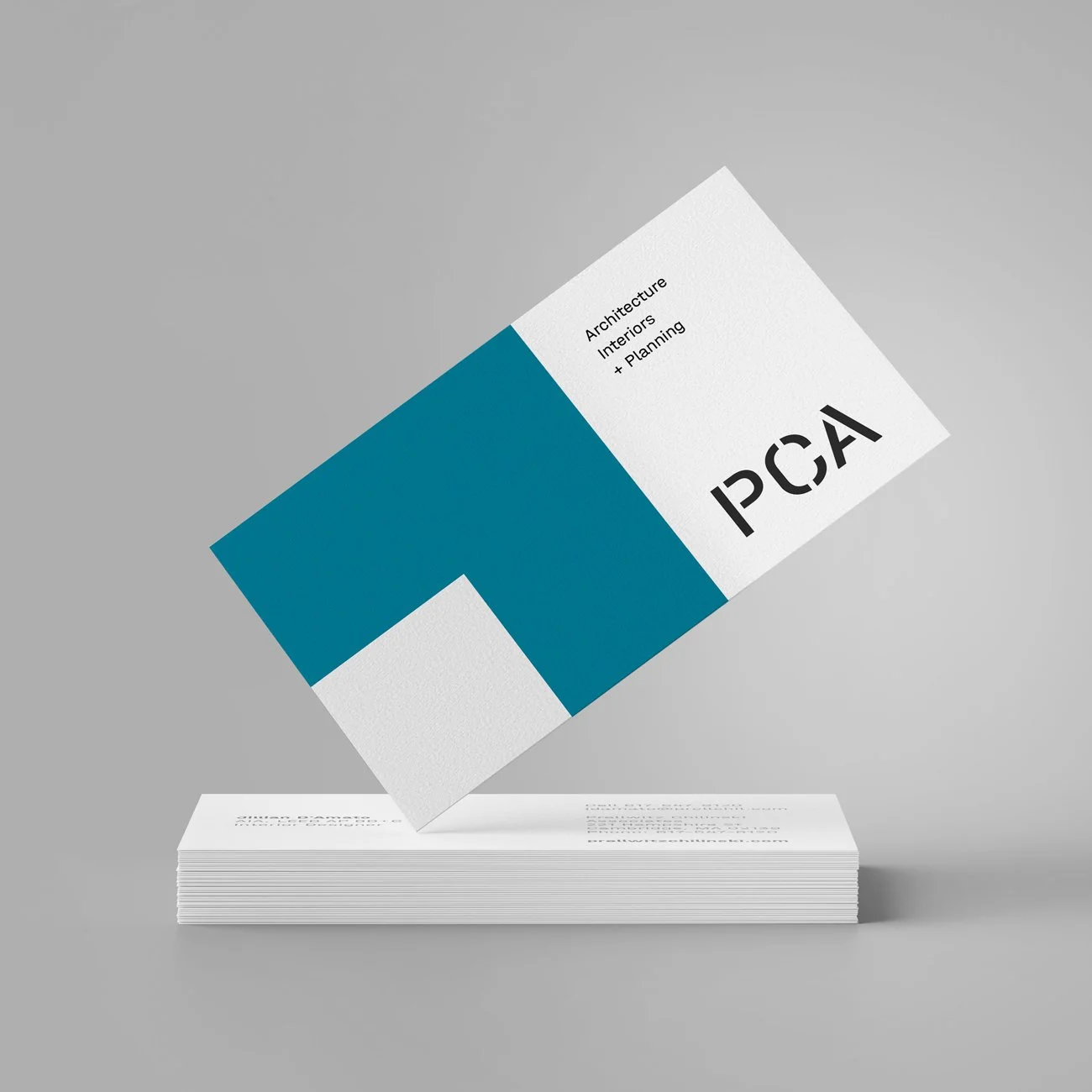
We transformed this insight into a cohesive breathable brand that showcased PCA's expertise and positioned them for their next chapter of growth. This is best expressed through PCA’s graphic brand system. Based on a square grid, it functions as a flexible playing field for bold blocks of colour, and work equally well in all mediums, specifically digital, print and signage.
Project scope: brand strategy, identity refresh + applications, website, digital templates, signage


The Combo combo:
Project lead: Combo Creative
Design: Christina Lauer and Leon Sloth
Coding: Glance Digital

