A refreshingly modern update
MEASURED ARCHITECTURE
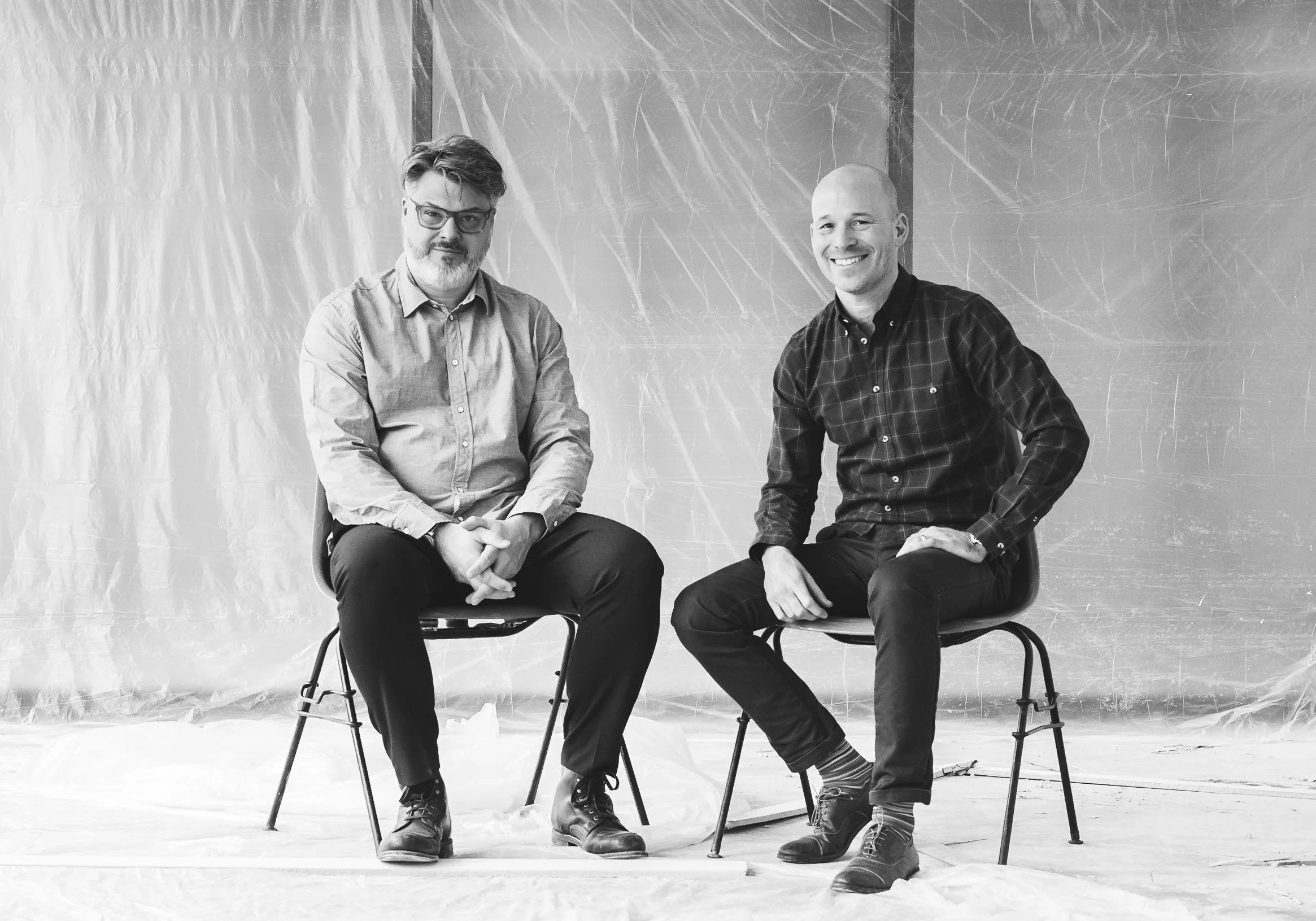
Measured Architecture is a Vancouver-based studio focused on modern design, interiors and landscapes. Its dedication to situational modernism—a subject-based, humanist approach that considers a project through the aspirations of a client, the opportunities of a site and the constraints of a municipality, budget and schedule—has earned the studio the lasting affection of clients and an array of awards over the years.
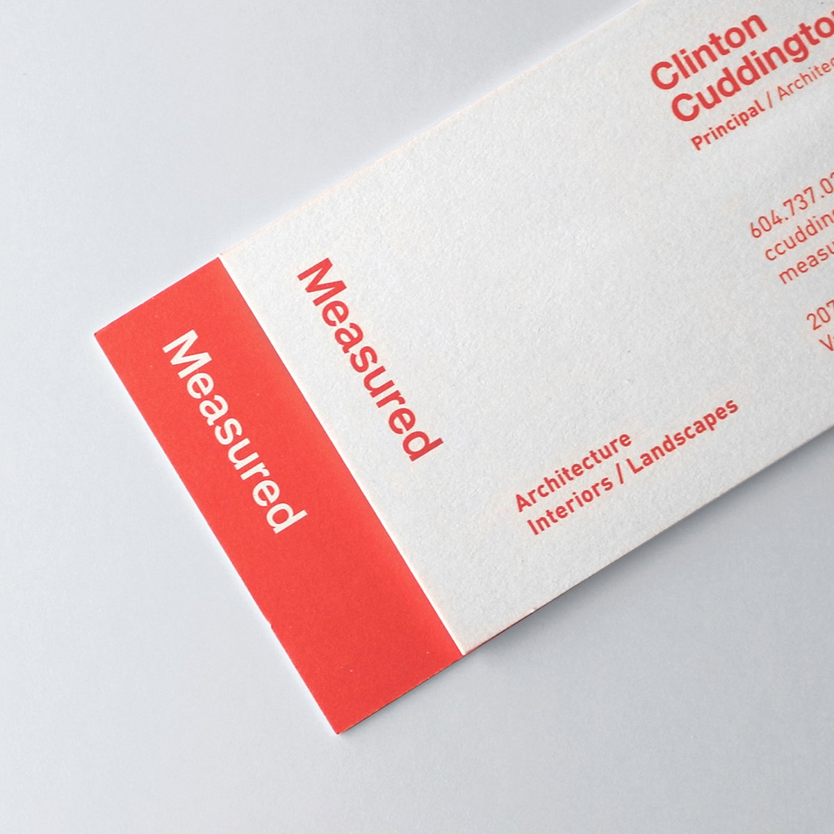
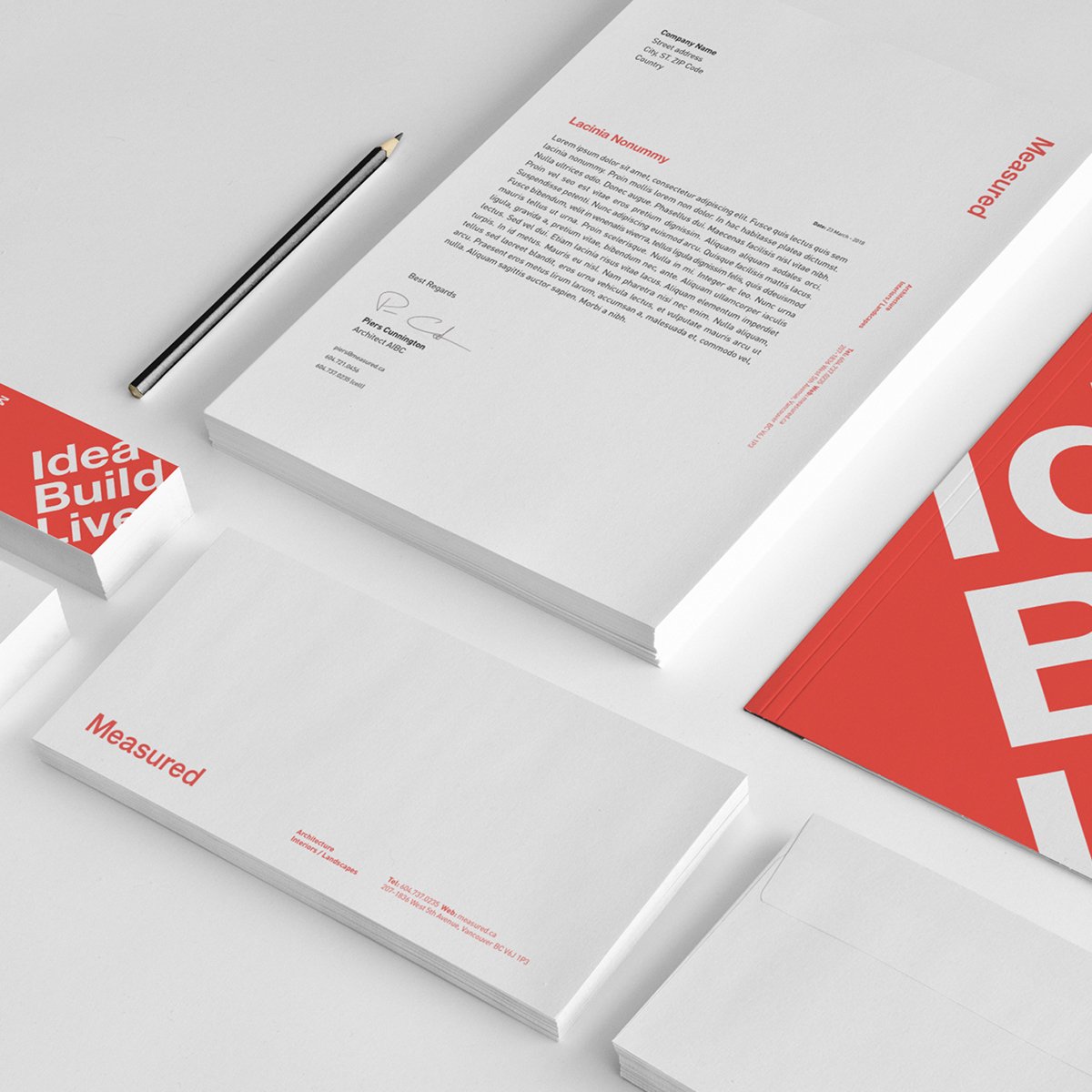
After 10 years in business, the Measured principals were ready to align the studio’s brand to the reality of its thriving architectural practice. Combo assembled a top-notch creative team to establish a brand strategy and to execute the materials based on it, including a custom WordPress website that highlighted Measured’s work and process.
The website was from the start the heart of Measured’s refreshed brand. Combo's goal was for the site to reflect the brand’s open and flowing spirit, visually achieved through a straightforward, square-based grid paired with bold typography.
The site brings the studio and its team into vivid focus, allowing visitors to get a deep sense of the humanistic manner in which Measured approaches its work. Each project page narrates through writing and images the story of a space from start to finish, or in Measured's language, from “idea” to “build” to “live.”
Because Measured’s unique process and the spirit of collaboration is as important to the principals as the finished projects, we assigned equal space to these areas. Combo also took care to ensure the site backend was highly automated, creating efficiencies that made ongoing management easy.
Project scope: strategy, identity refresh + applications, website, writing, photography


Combo combo:
Strategy: Combo Creative
Writing: Su T Fitterman + Sam Dunner
Design: Christina Lauer and Leon Sloth
Photography: Yasmeen Strang
Coding: Glance Digital
Awards + Nominations:
Awwwards – Honorable Mention
CSS Winner – Site of the Day, Winner

